terra-docs
User Needs
The Client (Terra) asked us to create a Dashboard Web App, which integrates with their pre-existing Terra Widget. This Dashboard would allow users to connect their wearable accounts via the Terra Widget, and then view meaningful health data and analysis via graphs, charts, suggestions based on the users health data etc. The Dashboard should also be simplistic and easy to use, hiding the complexity of the widget and connections of different wearable data models.
Verification Protocols
During the design process, we met regularly with the client, especially during the beginning of the project. These discussions helped mold the direction of the project and gave us a clearer understanding of the goals of the project combined with our unique suggestions, to produce the final product. These discussions were recorded in the meeting minutes section of the project
Gantt Chart


Design History
The idea is to create a website to view this on with the potential to move this to an app in the future. For the backend Node.js was agreed on while frontend would be implemented using React. We will also need to have a database which we can pull data from to display our analysis on the website for which we are using MONGODB. This will also involve authentication via the backend to ensure use of a Terra account. From this we were able to decide on goals to achieve by each weekly meeting which are as follows:
1 - Basic Design (front end :log in back end : stores the log in details)
Our first step was to understand how the Terra’s API works and the use of webhooks. The first draft was just a basic login page and the back end was set up to store the login details requesting a session ID and opening the widget which will allow us to pull the user data later.
One of the key features of Terra is pushing data asynchronously to an endpoint. It allowed us to receive data whenever it is available by the user’s wearable without having to query it. One can receive large amounts of data without worrying about the payload size in a classic HTTP request.

2 - Authentication flow : getting the widget open and verifying connected wearables
Now that we were able too receive data from Terra, we had to connect the users wearable accounts to the webapp. Using Terra’s widget, a user can login and connect their different wearables and complete the authentication process to allow Terra to access their wearable data.

 Authentication Flow diagram
3 - Implemented the database flow to store and retrieve data & started adding unique ids for each session (each sessions we generatean id through a hash and store it with wearable id show code)
Created a sensible database schema that allows us to query information for separate wearables by date and type of data. Also separately storing all a user’s connected wearables.


4 - After having a fixed architecture for our Front end and Back end we Redesigned the user interface with template given by Terra.

Upon getting the template the company wanted us to follow, we came up with our final design to meet their criteria. We changed colours, added logos and refactored our dashboard to display data in a similar way, while keeping some of our ideas. Aiming to reduce an overload of information on the page and display it in a sleek way.

5 - Health observations and suggestions
While our main goal was to display data from different sources for the user, we also wanted to offer a deeper analysis. Going further into the data analysis and doing research on health and fitness guidelines and trends, we were able to generate suggestions to improve their health. These suggestions can be related to their nutrition , sleep, sport performance but also stress and anxiety and overall wellbeing.

6 - Analytics pages for further analysis and visualisation
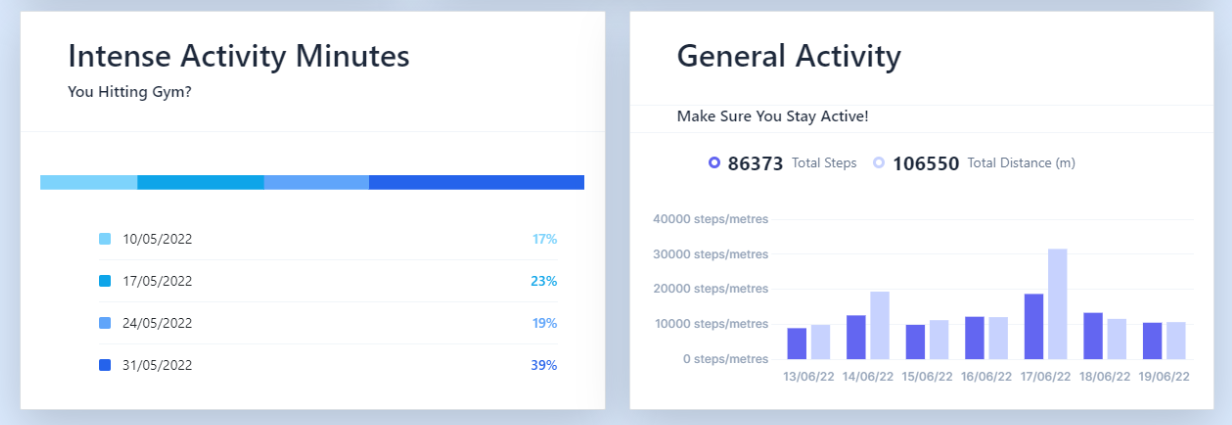
In line with idea to dig deeper in our analysis, an analytics page has been added which displays more details to the user on their data.
Our dashboard was mainly separated in 3 blocks :
- nutrition (calories consumed)
- health (sleep , heart rate)
- performance (calories burned, daily activities)
The analytics page is a place for the user to have access to more information and deeper analysis and suggestions, over more datasets and aspects of the users health . For example the user can have a breakdown of its macro-nutriments per day but also his exact sleeping pattern …